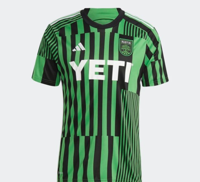
Austin FC is entering its third MLS season and we as fans are incredibly fortunate to have enjoyed our primary VerdeBlack kit. It’s iconic, unique color and pattern for the league, and made clear our love of something incredibly important in all of our lives: double insulated tumblers. Seeing those colors all over Austin has connected us to the club and to each other. Unfortunately all good things must come to an end and that kit will no longer will be worn by Austin FC. It is thusfar the only kit Austin has worn where they have won more matches than they’ve lost (18-16-8 between 2021-2022).
Due to Adidas’ contract with MLS every club gets a new kit every season, we started with the Adidas white away kit and our iconic VerdeBlack kit, last year we added the Sentimiento Kit, and this season we’ve added the Los Voces kit.
Now that Adidas has added a fourth game kit for the club (and no, the PrimeBlue Kits don’t count, shame on you for even suggesting that in your mind) it’s time for us to do what we do third best (After hilarious photoshops of players and using poultry to predict matches): a ranking of something Austin FC related.
1) The Verdeblack Kit

As mentioned above, this is a great kit. It’s distinctive and easily recognizable even from far away. The Adidas stripes even work with the white matching the YETI logo as accents all the way down to the shorts and socks. If the author had their way this design would be a mainstay for the club in the same way Arsenal wear red shirts with white sleeves or Newcastle has black and white vertical stripes. Kit designs that are synonymous with the clubs through decades. I hope that at the end of the 100 year war we return to this kit after winning MLS Cup, CCL, US Open Cup, Leagues Cup, and whatever new competitions have been invented by then while wearing this kit.
2) The Sentimiento Kit

The author has to admit they went through many stages of feelings after this kit was announced. It began with being dismintpointed, astonminted, and ultimintely contminted at how it looked in person. I mean…

Just look at how flattering those shorts are for the players to wear, and the mint is a distinctive color no other team had this season as a solid. The details work as it sticks to only one color besides the solid for a cohesive design. The downside being that the color shows stains too easily in our flying liquid filled supporter’s section.
3) The Legends Jersey

This was during a particularly bright time at Adidas when their designers simply forgot that kits can be different colors than white. It’s…a white kit with the Verde Adidas stripes and only worth remembering because it was the kit worn for the first Austin FC goal by Diego Fagundez and the first three Austin FC matches. Unfortunately it also saw Austin win only 3 of 13 matches wearing it and no one was sad to see it go, so it’s ranked last in our list and for it to not maintain this spot there would need to be a catastrophically bad design choice.
4) Las Voces Kit

Oh.
Oh.
Oh no. This. Just…..this? Maybe we are wrong for wanting Adidas to try more interesting/advanced designs on kits. The kit is separated into blocks all along the front with stripes of varying widths (as we tweeted about weeks ago) which gives it no sense of cohesion or coherent design. The wider stripe under the crest looks like a design note that the crest didn’t “pop” enough so they changed that one stripe without thinking about how weird it looks compared to the thinner stripes all over. It also has a “busy in the front, calm in the back” aesthetic that we cannot support outside of the back of the kit being Verde. It’s disappointing to say the least to go from such a classic home kit design to something that will only be remembered as the kit Austin FC hoist their first MLS Cup while wearing.
See you in 365 days for the next installment of these rankings where the Sentimiento Kit will be replaced.

2 thoughts on “The Definitive Austin FC Kit Rankings”